
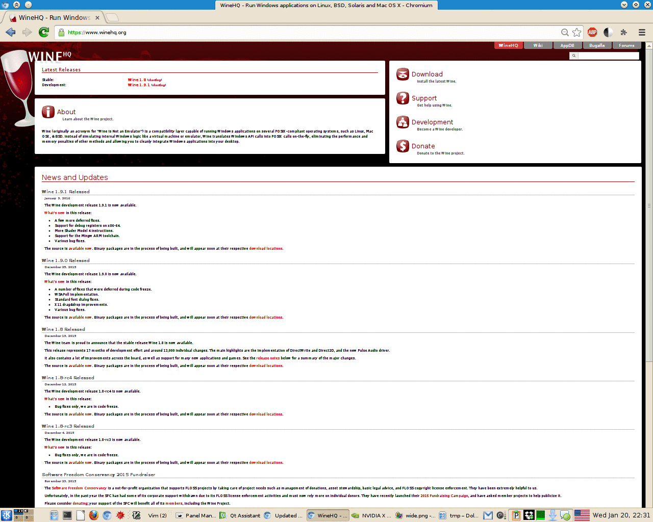
I have updated the WineHQ.org main website with a new mobile friendly (bootstrap based) theme.
The goal was the preserve the old look somewhat, while bringing it up to modern standards.
I've ported most of the existing translations for the home page. Sub-pages will need to be updated.
Translators, please update your sub-pages. Please update download.template first.
-N

Hello,
Current version makes the Download/Support/Development/Donate block have twice the needed height with my 782px wide Chromium window, i.e. has empty space under the links.
Other than that, it seems OK, thanks for the update.
Regards, Ruslan
On Tue, Jan 19, 2016 at 10:01 PM, Jeremy Newman jnewman@codeweavers.com wrote:
I have updated the WineHQ.org main website with a new mobile friendly (bootstrap based) theme.
The goal was the preserve the old look somewhat, while bringing it up to modern standards.
I've ported most of the existing translations for the home page. Sub-pages will need to be updated.
Translators, please update your sub-pages. Please update download.template first.
-N
On 01/20/2016 12:10 AM, Ruslan Kabatsayev wrote:
Current version makes the Download/Support/Development/Donate block have twice the needed height with my 782px wide Chromium window, i.e. has empty space under the links.
This is by design. I added some jquery-fu to make sure that box was the same height as the two boxes to the left of it. I think this looks better than a larger empty black space under it.
I do notice that at that width that the Development link does get a bit too close to the edge of the box. Perhaps I should shrink down the font size by a couple of px.
-N
On Wed, Jan 20, 2016 at 10:19 PM, Jeremy Newman jnewman@codeweavers.com wrote:
On 01/20/2016 12:10 AM, Ruslan Kabatsayev wrote:
Current version makes the Download/Support/Development/Donate block have twice the needed height with my 782px wide Chromium window, i.e. has empty space under the links.
This is by design. I added some jquery-fu to make sure that box was the same height as the two boxes to the left of it. I think this looks better than a larger empty black space under it.
I do notice that at that width that the Development link does get a bit too close to the edge of the box. Perhaps I should shrink down the font size by a couple of px.
OK, that thing was due my too old Chromium, it appears not reproducible with current versions.
The jquery-fu though seems to not always work, namely with zoomed out page, see "zoomed" attachment (zoom is 50% there). This remains true with up-to-date Chromium and Firefox.
-N
This is why I miss using tables for HTML layout. This kind of problem was easy to solve with tables. But Nooooo tables are bad now. :-|
I only applied my resize handler to the right side. I could apply it to the left side as well, but I think that will cause issues as the two sides fight over who should be the correct height.
On 01/20/2016 01:44 PM, Ruslan Kabatsayev wrote:
On Wed, Jan 20, 2016 at 10:19 PM, Jeremy Newman jnewman@codeweavers.com wrote:
On 01/20/2016 12:10 AM, Ruslan Kabatsayev wrote:
Current version makes the Download/Support/Development/Donate block have twice the needed height with my 782px wide Chromium window, i.e. has empty space under the links.
This is by design. I added some jquery-fu to make sure that box was the same height as the two boxes to the left of it. I think this looks better than a larger empty black space under it.
I do notice that at that width that the Development link does get a bit too close to the edge of the box. Perhaps I should shrink down the font size by a couple of px.
OK, that thing was due my too old Chromium, it appears not reproducible with current versions.
The jquery-fu though seems to not always work, namely with zoomed out page, see "zoomed" attachment (zoom is 50% there). This remains true with up-to-date Chromium and Firefox.
-N

Three suggestions:
- Maybe load less news items and make the "More news" link more obvious instead? I don't think we need to hear as far back as ~10 releases on the front page. I'll take a faster, leaner frontpage any day. - Search box missing "Search" placeholder (cf wiki) - Nothing to do with the new theme but a drop-up menu (with a link fallback) for the language switcher would be nicer than loading a separate page
On Tue, Jan 19, 2016 at 9:01 PM, Jeremy Newman jnewman@codeweavers.com wrote:
I have updated the WineHQ.org main website with a new mobile friendly (bootstrap based) theme.
The goal was the preserve the old look somewhat, while bringing it up to modern standards.
I've ported most of the existing translations for the home page. Sub-pages will need to be updated.
Translators, please update your sub-pages. Please update download.template first.
-N
On 01/20/2016 01:09 PM, Jerome Leclanche wrote:
- Maybe load less news items and make the "More news" link more
obvious instead? I don't think we need to hear as far back as ~10 releases on the front page. I'll take a faster, leaner frontpage any day.
I'll cut it down to 3 items.
- Search box missing "Search" placeholder (cf wiki)
Will do.
- Nothing to do with the new theme but a drop-up menu (with a link
fallback) for the language switcher would be nicer than loading a separate page
Sure, I can implement that sometime.... someday.
-
 Jeremy Newman
 -
 Jerome Leclanche
 -
 Ruslan Kabatsayev